Tower: A Display Font That Elevates Digital Headlines
It started with a hero section. I was refreshing the homepage for a small creative studio’s portfolio site—clean layout, muted background image, strong visual hierarchy—and the default sans serif headline felt… safe. Too safe. Like it was whispering instead of announcing. So I dropped in Tower, swapped the H1 type, and suddenly the whole section leaned forward. Not louder—clearer. That’s Tower’s quiet superpower: it commands attention without shouting.
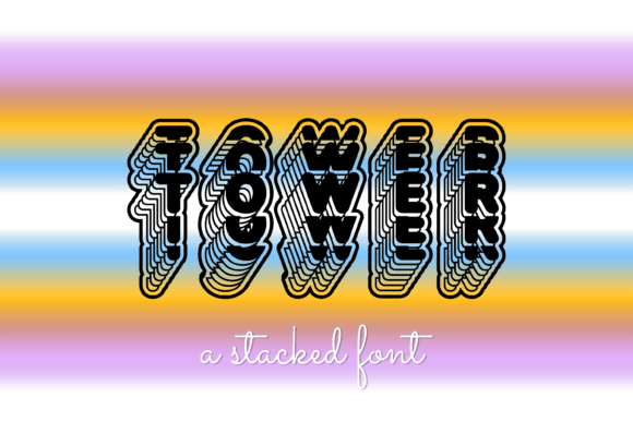
Tower is a display font with architectural confidence—sharp angles, balanced proportions, and subtle personality. It’s not ornate or overly decorative, but it carries presence. Think of it as the kind of typeface you’d trust to hold a headline over a full-bleed photo on a boutique online store, or anchor the top of a course sales page where first impressions shape engagement in under two seconds. Its letterforms have just enough character to feel intentional, yet enough neutrality to avoid distracting from content or brand voice.
In practice, I used Tower for three key areas on that portfolio site: the main hero headline, the “Featured Projects” section title, and the CTA button (“View Work”). Each placement revealed something different. Over the image banner? It held up beautifully—even at 48px on desktop and 36px on mobile—with crisp rendering across Chrome, Safari, and Edge. As a section header? It created instant visual separation from body copy set in a neutral sans serif (Inter, in this case). And as a button label? It worked—but only at larger sizes and with generous padding. Tower isn’t built for micro-interactions; it shines where space and intent align.
That’s an important readability note: Tower excels in short, high-impact uses. Hero titles. Section headings. Logo lockups. Banner text. Social media cover graphics. It’s not meant for paragraphs, navigation labels, or form fields. On mobile, I tested line-height, letter-spacing, and contrast carefully—especially against light backgrounds. With its slightly condensed structure, tight tracking can blur legibility on smaller screens, so I added letter-spacing: 1px and kept minimum size at 28px for headlines. Against dark backgrounds? It gains even more definition—great for campaign landing pages with bold, minimalist vibes.
I also tested Tower in a coaching website redesign. The client wanted warmth and authority—not cold minimalism, not playful whimsy. Tower struck that balance. Paired with a soft, open sans serif (like Manrope) for body copy and testimonials, it gave the site grounded elegance. No script font needed. No serif required. Just one confident display choice doing heavy lifting where it mattered most.
Font pairing matters—and Tower plays well with others. For digital brand kits, I’ve paired it with:
- A clean, variable sans serif (e.g., Inter, Space Grotesk, or IBM Plex Sans) for all UI text, body copy, and captions—creating contrast without conflict.
- A warm, low-contrast serif (e.g., Cormorant Garamond or Literata) for editorial-style blog headers or premium course pages—adding sophistication while keeping Tower as the standout voice.
- A monospace accent (used sparingly) for code snippets or technical highlights—giving the layout rhythm and texture.
What *doesn’t* work? Pairing Tower with another high-contrast display font, or stacking it with a busy handwritten style. It’s a lead vocalist—not a choir member. Let it breathe.
Before deploying Tower live, I checked the technical details—because real web projects demand it. It’s available as a webfont (WOFF2), includes standard Latin characters, and supports basic diacritics—enough for English, Spanish, French, and German sites. No extended Cyrillic or Arabic support, so I’d verify language needs early if working with global audiences. There’s one weight (regular), so I didn’t rely on it for bold/italic variants—I used CSS font-weight fallbacks or swapped to the base sans for emphasis instead. Licensing is commercial-friendly, which meant no hesitation embedding it in client templates, SaaS dashboards, or digital product kits.
One thing I appreciated: Tower loads fast. At under 40KB WOFF2, it didn’t budge our LCP metric—even with a single @font-face declaration and font-display: swap. No FOIT, no invisible text. Just smooth, confident typography appearing when it should.
Where else has Tower earned its place? A product landing page for a ceramic homeware brand—its structural clarity echoed the craftsmanship in the photography. A digital brand kit for a freelance strategist—used only in the PDF cover and social banners, never in UI, but instantly recognizable as the brand’s typographic signature. A blog header redesign where the old serif felt dated—Tower brought modernity without sacrificing warmth.
It’s not a Swiss Army knife. It’s a precision tool. And that’s why it works so well in digital design today: we don’t need fonts that do everything. We need ones that do one thing exceptionally well—and let the rest of the interface support it.
If you’re choosing a display font for your next web project, ask yourself: Where does your layout need clarity, not clutter? Where does your brand need distinction, not decoration? Tower answers those questions with quiet confidence. It doesn’t beg for attention—it earns it, every time it appears.